Exploring patterns in how candidate alliances affect Milton’s town-wide races
Contributed by Jay Fundling, Town Meeting Member, Precinct 3.
Are there patterns in how candidates do in different town wide races? Do candidates in different races pull from the same pools of voters?
In order to see how similar candidates’ performance in last year’s town wide race are to each other, I set up some correlations between their votes by precinct.
Some notes about correlation
(MATH!!! It will be brief)
Correlation can tell you how the movement of two groups of data are related to each other. In this case I’ll be looking at candidates performance in the town’s 10 Precincts. Correlation gives us results like:
- 100% – These two candidates votes moved together, in the precincts where one did well, the other did well. Where one did badly, the other did badly
- Negative 100% – These moved oppositely. Precincts where one did well, the other did worse
- 0% – They were unrelated. There is no relationship between how one candidate did in a precinct vs the other candidate.
Let’s look at an example or correlations from the 2021 School Committee Race:

Chart courtesy Jay Fundling
This race had four people running for two spots. You may recall that candidate Carroll and Denny were very open about running as a team, even having matching signs. Hegarty and Kociol also ran together.
So the chart above is not surprising. The correlation between Carroll and Denny is close to 100%. This means that precincts where one did well, so did the other and vice versa. Similarly Hegarty and Kociol have a correlation of almost 100%.
Note I have grayed out squares that we don’t need. We don’t need to see how Carroll’s votes were correlated with herself, and the squares in the bottom triangle would match those in the top triangle.
When you look across the groups – for example comparing Carroll and Hegarty – you get almost a -100% (negative 100%), meaning that where one did well, the other did badly.
From this we might conclude that the candidates were successful in letting the voters know who was running together, and the voters responded to that.
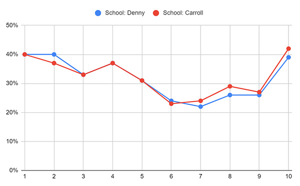
If we look at a graph of Denny and Carroll votes over Precincts 1 – 10, we see that agrees with the chart above, that they did well or poorly in the same precincts:
Graph Courtesy Jay Fundling
The chart of correlations from the School Committee race makes sense. Candidates explicitly ran together and the votes reflect that.
What if we look at other races from 2021?
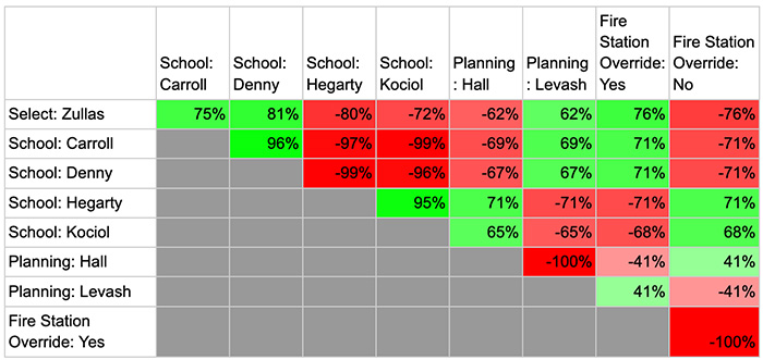
Chart courtesy Jay Fundling
I’ve added Mike Zullas’s results vs Phil Johenning, as well as the Planning Board race of Meredith Hall vs Rob Levash, and the results for the override for the fire stations.
What does this tell us?
First some easy things. Hall and Levash have a correlation of -100%. This makes sense, they were running against each other in a 2 person race, in a precinct where one does well the other does badly. (Note I am ignoring blanks or write-ins for all of these numbers)
Also in a two person race, correlations with other candidates mirror each other. Zullas has a -62% correlation with Hall and a +62% correlation with Levash.
So, what do these mean, and what do they not mean?
Zullas had a 62% correlation with Levash. Because that is a positive number, that means that in general precincts where Zullas did well, Levash also did fairly well. But because the number is not close to 100%, it means they were not in lock step like we saw with the School Committee race.
This chart does not say that people with a high correlation win together. For example, Ms. Hall has a low correlation with Denny and Carroll, but all three candidates won their races.
And Levash did well in the same geographic areas as Zullas, but Zullas got 83% in his race while Levash lost his. Even if their correlation was 100% it would not mean they would win or lose together, it would only mean they have strengths in the same parts of town.
This also does not tell you what the candidates stand for. If a candidate has negative correlation with voting Yes on the Fire Station Override, that does NOT mean that candidate opposed the override which passed with 79%.
Similarly, below we will compare candidates with the 2020 Presidential election results. If you have a bad (or good) opinion of Mr. Biden or Mr. Trump, a candidate having a high correlation with them does NOT mean they are similar or supporters of either president.
In summary, this charts indicates that Zullas, Carroll, Denny and Levash have strengths in the same parts of town as each other, and these parts of town also tended to support the Fire Station override. On the other hand, Hegarty, Kociol and Hall got their support from the same parts of town as each other, and these parts of town tended to be less supportive of the override.
To compare this to a national election I will add the correlations with the 2020 election results. To save space I will take out the column with No on the override. If you have been taking notes, you know that correlation with Yes and No are opposites of each other.
For this chart I’m using the percentage of the two person votes between Trump and Biden, excluding third parties.
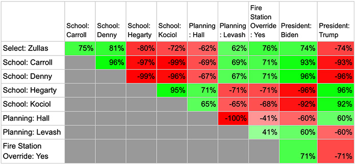
Chart courtesy Jay Fundling
To see the math behind my charts, you can go to my Google spreadsheet.
On the tab “Compare Two” you can choose two candidates and see their performance in all 10 Precincts. One graph shows candidates percentage by precinct, and the second graph puts them on the same level to make it easier to see the relative ups and downs.
What does this mean for the 2022 race?
What will we see in this year’s race?
From my observations of yard signs in town, there appears to be more clustering among candidates in different races this year.
Will we see correlations in the 60-70% range like last year?
Or will the correlations be higher with candidates moving together?





Be the first to comment on "Exploring patterns in how candidate alliances affect Milton’s town-wide races"