Commentary by Doug Scibeck.
Lately it seems our town is having a bit of an identity crisis. From debates about where to build much needed new housing, to what to do about the Hendries site, it seems like the town of Milton would like everything to be as it was in the 1940’s but still get the amenities of life in the twenty-first century. We want nothing to change, but demand the affluent lifestyle a prosperous suburb right next to Boston can offer.
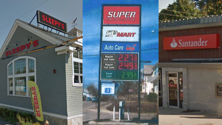
Part of the problem in reconciling the old town feel with modern convenience is that decisions are made on a case by case basis, with no rule or guideline to direct development. Business development and traffic around East Milton Square is a case in point, but the situation is illustrated on a more basic level when considering business signs. Back in 2014 the Board of Selectmen approved a new sign for Sleepy’s on Granite Avenue. They were left in a situation from a previous board, and apparently did what they could to mitigate problem, but the town was still left with an egregiously bright, multicolored LED sign being the first thing people see when entering the town from I-93. Other businesses in the square have bright back-lit signs that also serve to cheapen the look of the neighborhood.
Now Milton Gas, farther down Granite Ave from Sleepy’s, is seeking to build a new sign as part of the change in ownership. There are different proposals being floated but many fear that a larger, bright back-lit or neon sign will be chosen. Such a sign will not only be distracting and disruptive to residents, especially at night, but it will also advance the trend of devolving the whole of East Milton Square into an industrial looking zone.
Such a sign will not only be distracting and disruptive to residents, especially at night, but it will also advance the trend of devolving the whole of East Milton Square into an industrial looking zone.
The area is part of one of the three commercial districts in Milton. But a commercial district does not have to look like an industrial park. Despite the heavy traffic stemming from the highway this part of town is still a residential neighborhood with many families and that Milton small-town feel. With Andrews Park and Crane Field, East Milton is not a throw-away part of town. It is not Quincy and it is not Boston. The issue affects the whole town. If, for example, the Saltonstall property on Brush Hill Road is redeveloped into a Bed & Breakfast business, as was mentioned during a January Planning Board Meeting, what sort of sign will that be allowed?
In many ways Milton needs to join the twenty-first century. In terms of traffic management and commercial planning a town wide comprehensive strategy and vision is needed to guide growth for both a prosperous Milton and a Milton eminently livable for our families. Such a strategic vision needs to include how we portray our town in the commercial signs we permit. We are one town and the image one part of the town projects affects all of the town. A comprehensive and binding policy for signage is needed, not just the case by case decisions that seems to be how the town normally operates. We take pride in our town and the way it looks and feels. Businesses are more than welcome but they must respect and conform to the neighborhood feel many have worked hard to preserve.
About the Author:
Doug Scibeck resides in East Milton with his family, and is an East Milton Neighborhood Association board member.


Great piece, Doug!
Thank you Mr. Scibeck for this comprehensive overview. I look forward to future posts by you.
The Planning Board is seeking public input regarding potential revisions to the sign bylaw. Contact Assistant Town Planner Tim Czerwienski at [email protected] or 617-898-4969 for more information
Please take the Planning Board’s survey about zoning, signage, etc. It takes about 10 minutes and it’s important that the board has community input:
https://www.miltonscene.com/2015/07/take-the-milton-planning-boards-zoning-issues-survey/
No neon! No backlighting ! No oversized garish signs! Quiet elegance, and old fashioned charm should set the tone in all the business areas of our town. That will bring in the business with as little disruption of the well established neighborhood as possible. There’s no need for instance to have 25 foot high gas station signs in a location where it would be impossible not to see the station.the banks should be gracious enough to allow customers for restaurants to park in those lots after banking hours. That’s simple neighborliness. People are attracted to and willing to pay for charming little towns in this area. Whether to shop here, dine here, or settle here. Done correctly, everybody wins.
The Planning Board survey is also a good idea. I urge all to check it out.
I hope this is the appropriate site to post this comment. I continue to be troubled by the poor maintenance of the traffic triangle directly opposite St. Agatha’s Church dedicated to the late Monsignor Gallagher. The church grounds are beautifully landscaped with thousands of dollars of bushes, plants and colorful flowers. Yet, the small little plot of weed ridden, unmoved grass and sagging wreath stands in stark contrast to the parish Monsignor Gallagher served so long and so well. Could not the parish landscape this tiny memorial lot? If not, take down the dedication sign. Return it to the town.